
The fundamentals of the logo and visual identity are an important element to position oneself in the preference or at least in the focus of attention of audiences and consumers.
Logo, icon, isologo, and other elements form that essential part that allows identifying the brand. Below are eight fundamentals you should follow to make this element truly effective in its design and also in the message it needs to express.
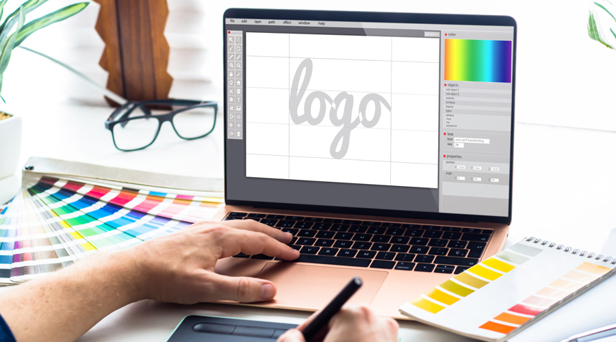
In order for the process of creating and developing a logo or visual identity to truly reflect the spirit and characteristics of the brand, organization, or character in question, it will be necessary to put into practice the fundamentals listed below.
- 1-Briefing
With the bases, objectives, and scopes to be achieved with the logo design. - 2-Creative environment
Knowing your competition, the prevailing trends, and the creative resources you have. - 3-Sketching
With color, shape, and image tests of the logo proposals. - 4-Typography
The logo should contain a font that is readable, understandable, and evocative. - 5-Color palette selection
Colors contribute to reinforcing the brand’s message, don’t use more than two or three. - 6-Revisions
They are done together with the client to adjust criteria and improve the design project. - 7-Testing
The design is tested in different sizes in digital, print, and other media formats. - 8-Publication
Even when the design is formally launched, there should be follow-up on its impact and possible changes.
And never forget the minimum aspects that must characterize a successful logo:
- It must convey the essential visual message.
- Ability to increase or decrease its size.
- Observable in different media formats.
- Easily recognizable from a distance.
- Capable of being remembered simply.
Common geometric shapes:
Square
Offers solidity, confidence, and stability, evoking masculine forms and symbolizing strength, which is why many established companies often resort to this shape.
Triangle
Provides a sense of stability when two vertices of the triangle are placed at the bottom of a visual composition, while the third vertex can generate an image of progress or a discharge towards another stage which, if directed upwards or to the right, is positive; if this vertex is directed downwards or to the left, it can generate thoughts of setbacks.
Circle
Psychologically, the circle is capable of referring to the origin of things and other forms, so it is often used to refer to the beginning of stories and the sense of the whole.
Line
It is often associated with the connection that exists between things and as a symbol of progress, communication, and collaboration between different entities. This action is performed by the letter S in the following example.
Spiral
It generates a sense of transcendence and excellence thanks to the path followed through a trajectory that represents stories and resonance.
If you’re interested in typographic logo design, Adobe has released a free application at https://www.adobe.com/express/create/logo/letters