

From the green hills of New Zealand to rugby fields around the world, the logo of the All Blacks, known as the “Silver Fern,” has transcended the sport to become a nationally and internationally recognized symbol. The evolution of this emblem not only reflects aesthetic transformation but also the rich history and deeply rooted cultural identity it represents.
Roots in New Zealand Nature
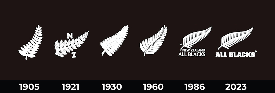
The starting point of this iconic image dates back to the use of the silver fern, a native plant of New Zealand, as a cultural symbol. From the outset, designers captured the distinctive essence of the fern, with its stylized leaves and silver glow, conveying a profound connection to the island’s nature.
The Beginnings of the All Blacks Logo
As the All Blacks gained recognition on the world stage, the logo underwent subtle changes. In the early years, the fern was depicted in simpler forms, often in black and white. This minimalist design, though modest, marked the beginning of the iconography that would become a symbol of power and prowess in rugby.


From Ink to Pixel
With the advent of the digital era, the All Blacks logo underwent modernization. Designers incorporated more stylized elements and fine details, taking the silver fern to new levels of visual sophistication. The colors black and white, which became the traditional team colors, emphasize the simplicity and elegance of the design, making the logo instantly recognizable in every corner of the planet.

Beyond Rugby
The All Blacks logo has transcended the realm of rugby to become an emblem of New Zealand identity. It has evolved into a representation of tenacity, unity, and a deep connection with the land. It is not merely a sports symbol but a visual expression of the history, culture, and passion that characterize New Zealand.
Over the years, the All Blacks logo has evolved, but its essence has endured. From its humble beginnings to its current status as a global icon, the silver fern has maintained its place as an unchanging symbol of excellence in rugby and Kiwi identity. The evolution of the logo not only speaks to aesthetic changes but also to a deeper connection with the very essence of the All Blacks and New Zealand. Ultimately, it is a testament to the design’s ability to capture the essence of a nation and project it to the world.
Related Topic: rugbyworldcup
You might be interested in: Historia del Logo de Los Pumas