A path towards minimalism
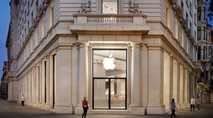
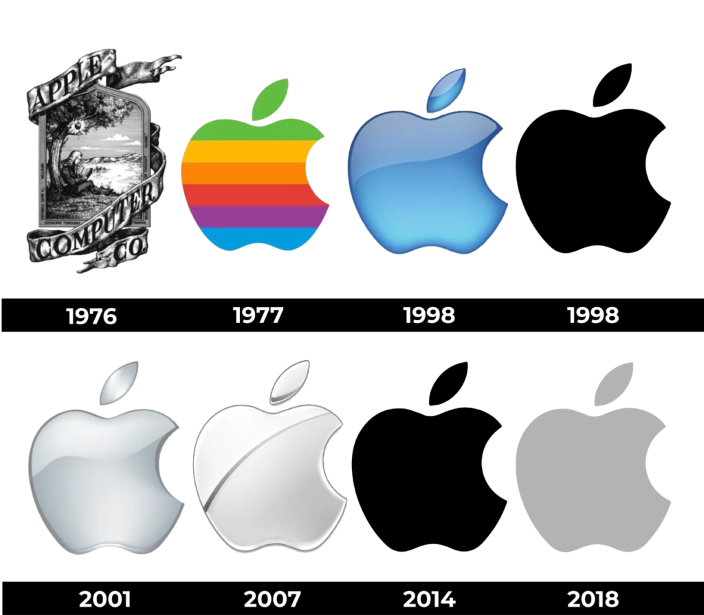
At the beginning of 1998, after Steve Jobs’ return to the company, the then CEO of Apple changed the logo again with the purpose of sending a clear message: Apple was ready to come back and revolutionize the world.
Throughout the years, the same bitten apple was kept, but with different graphic styles. Today, it is in a medium gray color.
Why is it a bitten apple?
There are several theories about the origin of the name and logo of Apple. One of them says that Steve Jobs liked apples very much, stemming from his work with a group of friends in an orchard in Oregon where he helped take care of the apple trees. Another theory points to the Apple Records music company of the Beatles, which Steve was a fan of. A third theory suggests that it’s because alphabetically, “Apple” comes before “Atari” (the company where he worked before founding Apple).