
The evolution of the Netflix logo has been a visual journey reflecting the growth and transformation of this streaming platform. From its humble beginnings to becoming a global giant, the Netflix logo has undergone significant changes over the years.
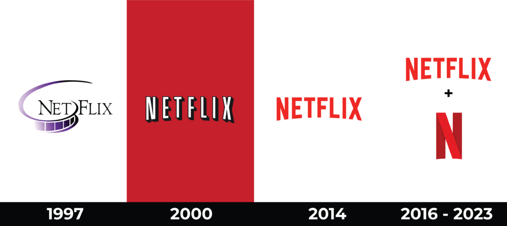
Beginning (1997)
The initial logo is characterized by a deliberate “lack of cohesion”. It visually breaks down into various fragments, introducing a distinctive separation. Notably, the uppercase letters “N” and “F” stand out, being larger than the uppercase letters “E,” “T,” “L,” “I,” and “X.” This intentional disproportionality serves to distinguish between the “Net” and “Flix” components.
Adding symbolic depth, the logo incorporates an element reminiscent of cinema. The first half of the word is inverted and dissolves against a white background. A dynamic atmosphere is achieved through a gradient in black and purple, infusing the design with a sense of movement. Furthermore, the logo comes to life with the use of a custom font featuring slender, elongated lines and sharp serifs, contributing to its animated and distinctive appearance.

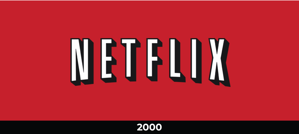
Transition to Red (2000)
In the year 2000, the company decided to give a new twist to its visual identity by adopting a revamped logo that involved a change in the inscription style. In this version, the word “Netflix” curves, forming a low arc. The designers drew inspiration from the old CinemaScope design technique to achieve this distinctive effect. The white, sans-serif letters are surrounded by black outlines and shadows. Thanks to this contrasting color scheme, they stand out prominently against a red background, effectively capturing attention.
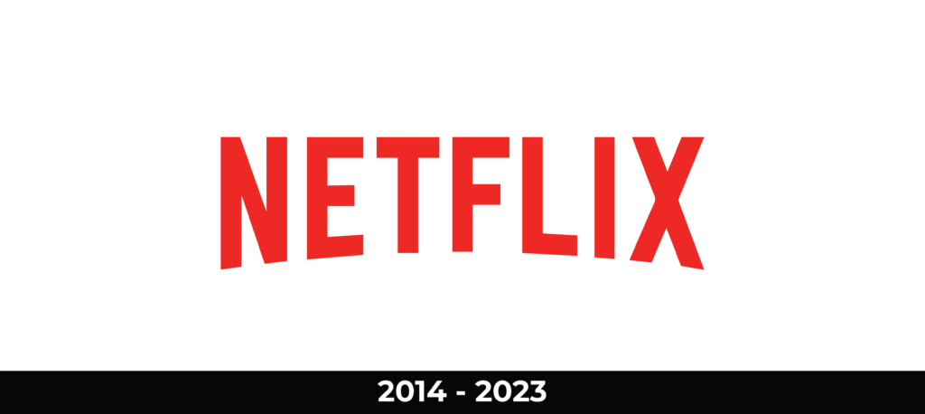
Worldwide Rebranding (2014)
En 2014, se llevó acabo un rebranding a nivel mundial. Este proceso involucró al estudio de diseño de Nueva York, Gretel. Los especialistas desarrollaron una nueva marca y modificaron la interfaz del sitio web. En el emblema actualizado, ya no hay sombras oscuras que anteriormente dificultaban la percepción visual. Solo se presenta el nombre de la empresa en rojo característico de Netflix. La inscripción se realiza con una tipografía personalizada basada en las fuentes Gotham Book y Gotham Bold.
In 2014, a global rebranding took place. This process involved the New York-based design studio, Gretel. Specialists developed a new brand and modified the website’s interface. In the updated emblem, there are no longer dark shadows that previously hindered visual perception. Only the company name is presented in the characteristic red of Netflix. The inscription is done with a custom font based on the Gotham Book and Gotham Bold typefaces.
Emblem (2016)
In 2016, a new element was incorporated into the brand’s visual identity: an icon in the shape of an “N”. This letter is composed of several wide lines created using different shades of red.
Service representatives explained that this emblem is used in conjunction with the main corporate symbol. Its use is primarily intended for mobile applications, social networks, and the website, and it is rarely featured in teasers and press materials. In the latter, it is more common to find a full-size version of the logo.

Present time (2023)
The Netflix logo has maintained its minimalist essence but with a contemporary touch. The word “Netflix” in solid red remains the centerpiece, indicating continuity and brand recognition.
Global Recognition
Today, the Netflix logo is instantly recognized worldwide. The deliberate choice of colors and design has contributed to building a globally iconic brand associated with the transmission of high-quality content.

The evolution of its logo is not just an aesthetic change but a reflection of the platform’s evolution and its role in how we consume entertainment in the digital era. With each modification, the logo has reinforced Netflix’s identity as a leader in the streaming industry.