History of the Mango Brand
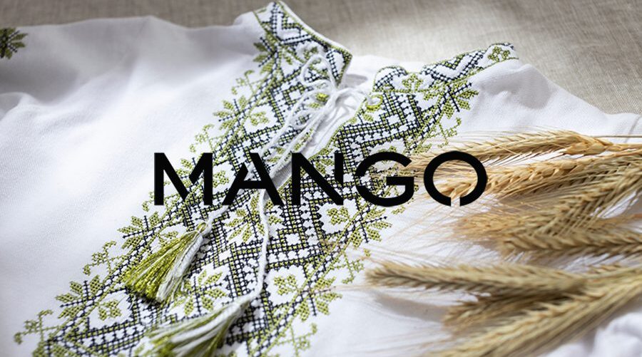
Mango is a Spanish fashion brand founded in 1984 in Barcelona by brothers Isak and Nahman Andic. Its history began when Isak, newly arrived from Turkey, started selling hand-embroidered shirts imported from India and Turkey.
The name “Mango” has a curious origin: Andic chose it after tasting this fruit during a trip to the Philippines. He liked its flavor so much and found it so easy to pronounce in different languages that he decided to make it the name of his brand.
From its first store in Barcelona, Mango quickly grew thanks to its combination of accessible fashion and contemporary design. Today, the brand is present in over 100 countries and is a reference in the fashion world.
Analysis of the Mango Logo
The Mango logo has evolved over the years but has always maintained a clean and modern aesthetic.


Clean and modern typography
- From the beginning, Mango has opted for a simple typography without unnecessary embellishments.
- Its current logo uses an all-uppercase sans-serif font, conveying modernity and elegance.
Use of Black Color
- The black color reinforces the sense of exclusivity and sophistication.
- It is a timeless shade that fits with the brand’s minimalist style.
Evolution Towards Minimalism
- In its early years, the logo had a more intricate design.
- Over time, it was simplified to just the word “MANGO,” achieving a stronger and more versatile visual identity.
The new design maintains a conservative approach in certain aspects, preserving key elements such as the uppercase and cut letters, the colors, and the overall layout. However, it leaves behind the more illustrative style of the previous logo in favor of a simpler, more sober, and impactful typography.

This change in visual identity was part of a broader transformation within the company led by Isak Andic. In 2011, Mango refreshed the image of its stores, replacing dark tones with raw colors on floors, walls, and ceilings, creating a brighter and more modern atmosphere.
The debut of the new logo took place at the presentation of the autumn-winter 2011 collection, held at the iconic Centre Pompidou in Paris. At the event, which featured model Kate Moss and other prominent guests, the brand unveiled its renewed visual identity, marking a milestone in its evolution.
Mango’s Branding vs. Other Fashion Brands
Mango’s branding is based on minimalist elegance, something it shares with other global fashion brands. Let’s see how it compares to some of them:
| Brand | Visual Identity | Brand Message | Branding Strategy |
|---|---|---|---|
| Mango | Logo en negro, tipografía limpia y mBlack logo, clean and modern typography. | Accessible sophistication, contemporary fashion. | Minimalism, campaigns with celebrities, stores in premium locations. |
| Zara | Uppercase logo with classic serif and wide spacing. | Fast fashion, runway inspiration- | Constant collection renewal, exclusivity based on limited availability. |
| H&M | Sans-serif typography in vibrant red. | Affordable fashion for everyone. | High production volume, variety of styles, inclusive campaigns. |
| Massimo Dutti | Logo en negro coBlack logo with elegant serif. | Affordable luxury, classic and timeless fashion. | Focus on premium materials, more exclusive branding. |
What makes Mango unique
- Elegant minimalism: Unlike H&M, which opts for vibrant colors, Mango maintains a more sophisticated aesthetic with its black logo and clean typography.
- Aspirational yet accessible: It is not as exclusive as Massimo Dutti nor as mass-market as Zara, striking a balance between quality and price.
- Celebrity campaigns: Mango has worked with figures like Penélope Cruz and Kendall Jenner, reinforcing its contemporary brand image.
- Strategic global expansion: Its stores are typically located in premium shopping areas, conveying a sophisticated brand image.
Conclusion
Mango has managed to position itself as a global fashion brand thanks to its consistent branding, which combines elegance, accessibility, and modernity. Its history, from selling embroidered shirts to becoming a fashion giant, is an example of how a brand can grow with a strong visual identity and a well-defined branding strategy.
If you like design and brand history, Mango is an interesting case to study: a name inspired by an exotic fruit, a minimalist visual image, and an international expansion strategy that has made it a fashion reference.