Vintage and retro may seem synonymous, but although they share a common past, their manufacturing date makes the difference.
Only vintage items are original from their era, while retro refers to items inspired by a style that predates their manufacturing date.
For example, a Smeg household appliance perfectly fits the style of the 1950s. If its manufacturing date is not from that era, it is not vintage but retro. That’s the key difference between retro and vintage—though both transport us to another time in appearance, only vintage items are original from their era, while retro items are inspired by styles that existed before their manufacturing date, often reinterpreting antique designs.
The word “vintage” originated from English and was initially a term used in winemaking, referring to the grape harvest or the year the wine was made. But extrapolated to other fields, it is now used as a synonym for “antique.”
Retro and vintage logo design
For modern designers, “retro” implies a long period that extended from the 1920s to the 1970s, and during the 1960s, these designs were very popular, hence the label “the golden era.” In this way, incorporating vintage and retro styles in designs is a way to pay homage to this era known for its multifaceted interpretations and innovative trends, and perhaps, the only way to reflect on this wonderful time.
3 tips that can be very useful when designing a retro logo:
- Appropriate color palette
- Typography
- Worn textures or ‘grunge’
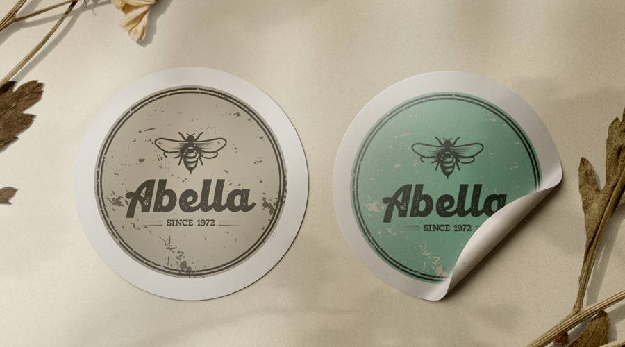
1. Vintage graphic design favors light and subtle tones, and colors like light gray, beige, brown, and green are the best options. You may also need to include relatively more saturated colors such as blue, orange, red, or others. Make sure they are as soft as possible.
2. When it comes to fonts, artistic typography is the best fit for a classic logo, which is why most font designers have various retro and vintage font options. There are definitely many excellent typography choices for vintage and retro logos.
3. Noise is a great effect that should be used correctly. It can give your logo an aged or weathered appearance that fits well with a retro logo design.
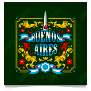
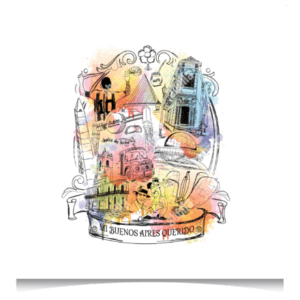
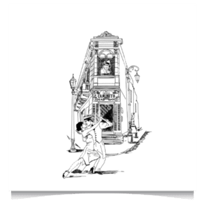
In my portfolio section, you can find some examples of retro designs.
If you want personalized advice, feel free to contact me.